Let’s get the disclaimer out of the way: the traditional draft value chart is outdated, and it never made much sense in the first place. Trying to use logic to explain why teams operate in an illogical manner is a tall task, and probably a waste of time. So, let’s try anyway.
First, I recreated my draft value chart. To do that, I looked at the first 224 players selected in each draft from 1970 to 2009. PFR assigns Approximate Value grades to each player in each season, but since AV grades are gross units, we need to tweak those numbers to measure marginal value. As a result, I only gave players credit for their AV above two points in each season; that difference is a metric I’m defining as a player’s Marginal AV. For example, if a player has AV scores of 8, 1, and 3 in three straight years, those scores are translated into Marginal AV scores of 6, 0 and 1.
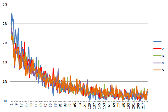
The graph below shows the average Marginal AV produced by each draft pick in each season from ’70 to ’09. The blue line shows the average Marginal AV produced by draft picks as rookies, the red line represents second-year players, green is for year three, purple for the fourth season, and orange for average Marginal AV in year five.

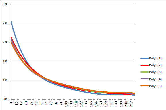
That graph isn’t all that exciting, and it’s probably a bit confusing. [1]In case you’re curious, the Y-axis represents the percentage of Marginal AV produced by that draft slot relative to the total Marginal AV from the top 224 draft picks in the aggregate. So let’s smooth the data. As it turns out, the lines are nearly identical to each other for players in four of the five seasons, but we get a dissimilar best-fit curve for rookies:

Now, let’s take a step back. We know that the Jimmy Johnson chart is too steep: it overvalues the top picks, and undervalues all other picks. If our goal is to recreate that chart, it appears as though we should only focus on rookie performance. Based on this information, the drop off in production from the the top picks to the rest of the draft is more significant during year one than during any other year. [2]A likely explanation: playing time due to draft status. Approximate Value is (intentionally) pretty heavily tied to playing time, so it makes sense that Marginal AV would be steeper for rookies.
Of course, just looking at the Marginal AV of rookies doesn’t recreate the traditional chart, which is much steeper than the curve above. But what if instead of using 2 points as our amount of replacement-level AV, we up that number to 6 points? [3]Why six? Trial and error, of course. Now, an AV of 10 turns into just 4 points of Marginal AV, an AV of 5 is worth zero, and an AV of 15 is worth nine points of Marginal AV. Well, if you do that, and look at only rookie season performance, you get something pretty similar to the traditional chart.
How similar? The graph below plots the average Marginal AV (replacement level = 6 points) of each draft pick from 1970 to 2009 and the values in the traditional draft value chart. I converted the Marginal AV data so that we could plot it on the same scale as the Jimmy Johnson draft value chart. [4]How did I do that? The JJ chart has 60,684.4 points of value, so I multiplied the average Marginal AV (using 6 as replacement-level) for each draft pick by 60,684.4, and divided by the sum of the … Continue reading In the graph below, the JJ draft values are in red, and the average Marginal AV data is in blue:

Pretty neat, eh?
So what’s an AV of 6 mean in real life terms? Here’s a list of players from 2013 with an AV of 6. It’s mostly bad starters ofN good teams or average starters on average teams. So, if you are only concerned with how a player performs as a rookie, and you only care about finding better than mediocre-starter performance, then the Jimmy Johnson chart actually does a pretty decent job of measuring the value of each draft pick. In other words, the chart tells you how likely you are to find an immediately valuable contributor in the draft, but little else.
References
| ↑1 | In case you’re curious, the Y-axis represents the percentage of Marginal AV produced by that draft slot relative to the total Marginal AV from the top 224 draft picks in the aggregate. |
|---|---|
| ↑2 | A likely explanation: playing time due to draft status. Approximate Value is (intentionally) pretty heavily tied to playing time, so it makes sense that Marginal AV would be steeper for rookies. |
| ↑3 | Why six? Trial and error, of course. |
| ↑4 | How did I do that? The JJ chart has 60,684.4 points of value, so I multiplied the average Marginal AV (using 6 as replacement-level) for each draft pick by 60,684.4, and divided by the sum of the Marginal AV for all draft picks. |
