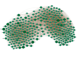
 Last week Chase announced this contest in honor of Football Perspective’s first birthday. Here’s the backstory…
A couple of years ago, I moved. The house I was moving into, like many houses, had walls. The walls did not have artwork pre-installed, so I spent a good six months of my life obsessed with finding good wall-art. Somewhere in there, I stumbled on the open-source visualization program called Gephi. It looked super-cool, so I decided to play around with it.
The bug/bean/Australia/peanut/hairball Chase posted last week is the result. In addition to framing one for my own wall, I framed one each for Chase and Lisk, and I mailed them off. I don’t use the word “hero” very often, but really, what other word is there for someone who is talented enough to create world-class art and generous enough to send it to his friends? This was a good thing I had done. So what’s a hero to do when he is told, tactfully of course, by both Chase and Lisk, that his art kinda sucks? I thought the bean’s worth was self-evident.
The mechanics are straightforward. I don’t even remember the specifics but, as you all figured out, this is a roster of the best players in modern-ish NFL/AFL history. The size of a player’s dot represents his quality, as measured by career AV or 100-95-90-… AV — I can’t remember which. The strength of a connection between two players is the number of games they played with and against each other. So Peyton Manning is strongly connected to Marvin Harrison, less connected to Tom Brady, still less connected to Brian Urlacher, and not at all connected to Dan Fouts or Bill George. The layout was determined by Gephi’s “force atlas” algorithm. My understanding is that it pretends the connections are elastic bands — the stronger the connection the tauter the band — and then lets the physics take over. Manning and Harrison naturally end up close together because they are connected by a tight band. Urlacher sort of wants to be close to Manning, but there are tighter bands pulling him in other directions so he doesn’t get too close. He does get closer than Dan Fouts does, though.
So the layout was unplanned, but has some emergent features that you all noticed: modern players on the left and older guys on the right, AFC/AFL on top and NFC/NFL on bottom, teammates clustered together, and the team clusters tend to huddle up next to their division rivals (note the Chiefs and Raiders in the upper right). To me, the most interesting part of the layout is the slight gap running down the middle populated by Payton, Dorsett, White, and Jones. Does this actually say something about those players and/or their era? Or is it just an artifact of the algorithm? I don’t know.
A few of the answers nailed the mechanics to the maximum extent possible under the circumstances. The first of these was JeremyDe. For this, he earns an automatic berth into the top three.
Chase kept demanding to know what was to be learned from this piece of art, and I never had a good answer for him. Chase believes that the proximity of Tony Gonzalez to Vinny Testaverde should tell us something about their careers that we didn’t already know. This is, I think, an unreasonable standard to hold art to. I really feel sorry for people like Chase who can’t shut down the analytical part of their brain long enough to feel the way art-lovers, like me, can. As Andrew Carroll says, “its beauty lies not in its meaning!” For this, and for the rest of Andrew’s answer, which is to literature as my bean is to art, he earns his way into the top three.
The final slot in the top three, in a bit of an upset, goes to Wade Iuele. Clear, straightforward, and correct.
Apologetic (sincerely) honorable mentions go to Scott Tanner, Arif Hasan, Travis Finck, and Eric Holland.
Final contest results:
Enjoy those prizes, guys, and happy first birthday to Football Perspective!
